Usability testing & benchmarking accessibility: A year in review
Summary of user experiences from 2,100 usability sessions with assistive technology users with disabilities
You forgot to get someone a gift. We’ve all been there. It’s time to do some last minute shopping. You know what you want to get, type it into Google, and you find it. You are now ready to purchase the product, but can’t find ‘add to cart’. You scour the page over again and again. Frustrated, you abandon your purchase for another website that might be easier to use.
Unfortunately, experiences like this one are common for people with disabilities and assistive technology users around the world.
Has an assistive technology user had a similar experience with your product or service? How do you even begin to find out? Usability testing with assistive technology users is a great place to start.
Usability testing with assistive technology users answers questions like, how enjoyable was the experience? Did my latest product update make it easier to use? Without metrics, answering these questions is challenging.
This is why we developed and use the Accessible Usability Scale (AUS). To measure the perceived usability of an experience for assistive technology users.
We’ve learnt a lot with AUS in 2022 and are excited to share it with you! In this piece we’ll go over:
- AUS vs. SUS
- Why did we create AUS?
- Data collection for AUS
- Results: Usability for assistive technology users
- Product usability for screen reader users
- The experience of assistive technology users – hear directly from our community of testers
- Usability: A 2023 competitive advantage
- How to get started with usability testing
AUS vs. SUS
If you have investigated measuring product usability in the past, you may have heard of the System Usability Scale (SUS). SUS is a popular and highly respected questionnaire developed by John Brooke in 1986 to measure satisfaction when using digital products like apps and websites.
AUS was inspired by SUS. Think of it like two cars built on the same frame, despite being different models. There are important similarities between AUS and SUS. Both scales are made up of ten questions and calculate a usability score out of 100.
The average SUS score is 68–this number comes from decades of research and responses from thousands of users. The average AUS score is 65 (three points off the SUS average). We determined this average by compiling data from 2,100 usability sessions, moderated and unmoderated.

The two scales have a remarkably similar reliability as well. The Cronbach’s Alpha, a consistency metric, of the SUS is .92, demonstrating that it has excellent reliability and all ten of its questions effectively measure the same concept – usability. The AUS? .93. Almost identical.
Why did we create AUS?
If SUS and AUS are so similar – why create AUS? We found the language of SUS not reflective of the experiences for assistive technology users with disabilities, making it less reliable for such users. AUS builds on SUS to quantify and measure the perceived usability of digital products for assistive technology users.
Learn more from Fable's COO Abid Virani on why and how AUS was created.
Data collection for AUS
So, where did these averages come from? We collected over 2,100 AUS scores from usability sessions, moderated and unmoderated, of various digital products to learn more about accessible user experiences.
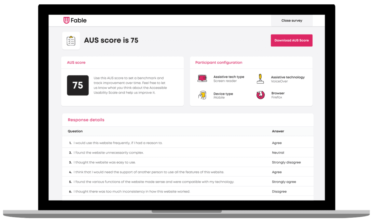
With every AUS submission, we also capture important data about the type of assistive technology being used to provide a deeper layer of insights. Specifically, we capture:
- The type of assistive technology being used, including:
- Screen magnification (assistive technology that presents enlarged screen content and other visual modifications)
- Alternative navigation (assistive technology that replaces a standard keyboard or mouse)
- Screen readers (assistive technology that outputs on-screen text using text-to-speech)
- The type of device being used (e.g., Apple iOS, Android mobile, computer)
- The type of browser being used
This is critical because it provides valuable insights into where their digital products might be failing and for which kind of assistive technology.
Learn more about assistive technologies in our Assistive Technology Glossary.
Results: Usability for assistive technology users
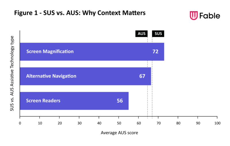
Figure 1 illustrates average AUS scores across these assistive technology types, along with how they compare to the typical SUS average.

This data shows, on average, digital tools perform relatively well for screen magnification users. We also see that the average AUS score of alternative navigation users tends to sit quite close to the SUS average.
Based on this data, if your company only has the time and resources to focus on improving the experience of one type of assistive technology user right now, magnification and alternative navigation users are not the most impactful place to start. Screen reader users would be.
Product usability for screen reader users
One of the clearest lessons from this data is: on average, screen reader users have significantly lower levels of satisfaction with digital products than the general population and even other assistive technology users.
Here's another way to think about it, based on our data:
1 in every 2 screen reader users has an AUS score of 56 or less, compared to just 1 in every 5 members of the general population with a SUS score of 56 or less.
But that's near to the average right? Technically yes, but let's give some context to these numbers.
A score of 56 is a grade of a D according to SUS standards. You'll be hard pressed to find any area where a D feels sufficient.
The average score for screen reader users represents inefficient and frustrating digital experiences. Being average isn't good enough when it comes to usability for a screen reader user, who disproportionately uses websites and apps to be independent.
In the following section, you'll get more context into the experience that results in a 56 AUS score.
The experience of assistive technology users
Instead of hearing it from us, hear it from some of our community of testers who have contributed to this data.
Fable testers are a diverse community of individuals who live with a disability and use assistive technology as part of their daily life. Our community supports our customers to make digital products more accessible.
Below find examples of the user experience of scores at the 25th, 50th, and 75th percentiles
Usability: A 2023 competitive advantage
If you had an experience like those described in the 25th and 50th percentile, would you try to complete the purchase? Ask somebody else for help? Or would you find a different place to shop? When assistive technology users have a bad experience, they will move on to your competitors who have a more usable and accessible experience.
Further, assistive technology users and those with disabilities show brand loyalty towards companies that have accessible and usable experiences. Assistive technology users and people with disabilities will recommend accessible products to other assistive technology users (and discourage them from trying inaccessible products).
In our current time of economic hardship, companies of all sizes are being tasked with reaching as many customers as possible to maximize their impact. Those working towards accessibility not only have a competitive advantage that unlocks billions in spending power today, but are also future-proofing for a changing population. As our world's biggest generations (boomers and millennials) age, they will require many of the same assistive technologies and usability considerations to use digital products as people with disabilities do today.
Usability testing is a direct path to industry-leading innovation. Features like autocomplete, pinch to zoom, dark mode, captions, and voice assistants like Siri and Google Home all started as accessibility features for those with disabilities. Now they are product must-haves enjoyed by all.
As Jutta Treviranus, Director and Professor of Inclusive Design Research Centre at OCAD University, said "when you design for the margins, you get the middle for free."
This is why leading teams like Shopify, Slack, and Walmart consistently test their products with assistive technology users with disabilities through Fable Engage. As Deanna Stacey, Vice President Digital, Loyalty & Solutions Delivery at Porter Airlines said:
"Porter is focused on providing an accessible journey, across devices. Because people deserve independence. Moving forward, we're committed to doing more to incorporate accessibility testing in the building phase, not just the validation one. And we're proud of the work we do with Fable to achieve this."
Try AUS for your digital product
So, how usable are your digital products or services? Meet with a digital accessibility specialist, get a free unmoderated usability session to get your AUS score, and answers to any usability questions you may have.

