Building the Accessible Usability Scale
In the early days of Fable, I was attending an #A11yTO meetup at the Firkin on Yonge in Toronto. I remember sharing the idea of what we were building and being asked a question that I didn’t know the answer to, “Are you helping with accessibility or usability for people with disabilities?”
Low-hanging fruit
It was early 2018 and Fable had only just started to engage screen reader users in digital product testing. If you’re unfamiliar with screen readers, they are a common assistive technology (AT) for people with blindness to access and navigate computers. Almost everything that we were finding on websites had to do with poorly labelled form elements and a lack of structured content, common issues that are often referred to as low-hanging fruit when it comes to accessibility.
“Low-hanging fruit doesn’t mean low impact.” – Samuel Proulx, Community Manager, Fable
Accessibility or usability?
The W3C says that web accessibility relates to people with disabilities being able to equally perceive, understand, navigate, and interact with web content. They then define usability as relating to a user experience being effective, efficient, and satisfying. These ideas are different, but not mutually exclusive.
At Fable, we help advance both accessibility and usability. Through thousands of hours of customers engaging people with disabilities on Fable’s crowdtesting platform, our customers are making products easier to understand and navigate. Accessibility is often measured by conformance to the Web Content and Accessibility Guidelines (WCAG). But how do we measure usability for people with disabilities?
Measuring usability for assistive technology users
As companies build and mature their accessibility programs, we often see common themes materialize. After a team builds accessibility into their development cycle and addresses their backlog of WCAG issues, the focus shifts to user experience. Companies consider “do AT users like our product” and how “does the UX compare to the rest of our users”?
In hindsight, “time to complete a task” was the least meaningful metric that we found in our efforts to measure user experience at Fable. The time it takes for an AT user to complete a task can be a valuable datapoint at the individual level but loses utility in aggregate. The problem is with averaging and comparing. Comparing an expert JAWS user to a novice Dragon NaturallySpeaking user is not meaningful. When looking at data related to the time to complete a task, the likelihood of misinterpretation increases. These experiences are fundamentally different.
Build on something that works
The System Usability Scale (SUS) was developed in 1986 by John Brooke. It’s one of many psychometrically designed surveys, though it is unique both in that it remains popular and has been consistently used by organizations for decades. John Brooke’s objective with the System Usability Scale was to take a quick snapshot of people’s satisfaction when using systems, or what we’d commonly refer to today as digital products like apps and websites.
The context is different for an AT user
The SUS consists of ten statements to be responded to on a Likert scale, which is multiple choice with options ranging from ‘Strongly Disagree’ to ‘Strongly Agree’.
One of the questions in the SUS survey is, “I think that I would need the support of a technical person to be able to use this system.” Imagine a screen reader user was going through a sign-up form that required them to draw their signature. In this case, the user likely requires assistance not from a technical person, but another person who doesn’t rely on a screen reader themselves.
Another question is, “I would imagine that most people would learn to use this system very quickly.” In this case, assistive technology users are highly aware that their experiences are unlike most users.
By adapting the SUS questions to relate to the context of an assistive technology user more meaningfully, we can similarly quantify and measure the perceived usability of digital products for assistive technology users. Now, the framework can still measure usability issues, but can do so for those who are impacted by accessibility issues.
Presenting the Accessible Usability Scale 1.0
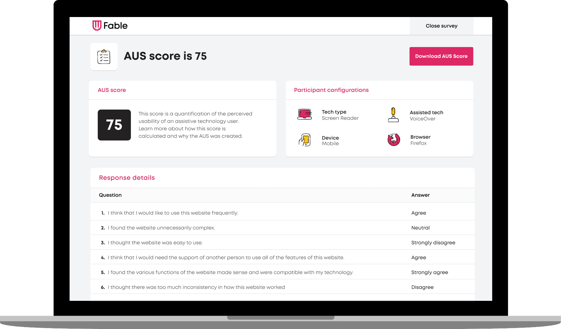
In the first iteration of the Accessible Usability Scale (AUS), we decided to specify the system we are asking for feedback on. It’s easy to replace the word “system” with one that better aligns to how digital products are referred to today such as “website” or “app”.
We also updated some of the language to make it easier to understand and less vague.
Read how this compares below:
| Accessible Usability Scale | System Usability Scale |
|---|---|
| I would use this website frequently, if I had a reason to. | I think that I would like to use this system frequently. |
| I found the website unnecessarily complex. | I found the system unnecessarily complex. |
| I thought the website was easy to use. | I thought the system was easy to use. |
| I think that I would need the support of another person to use all the features of this website. | I think that I would need the support of a technical person to be able to use this system. |
| I found the various functions of the website made sense and were compatible with my technology. | I found the various functions in this system were well integrated. |
| I thought there was too much inconsistency in how this website worked. | I thought there was too much inconsistency in this system. |
| I would imagine that most people with my assistive technology would learn to use this website quickly. | I would imagine that most people would learn to use this system very quickly. |
| I found the website very cumbersome or awkward to use. | I found the system very cumbersome to use. |
| I felt very confident using the website. | I felt very confident using the system. |
| I needed to familiarize myself with the website before I could use it effectively. | I needed to learn a lot of things before I could get going with this system. |
A format that works with a little math
The System Usability Scale format includes alternating statements, forcing participants to carefully read each statement and respond accordingly. This model is well proven to minimize extreme response. There also is an “all positive” SUS but the standard, alternating format is much more widely used.
The first step in quantifying the perceived usability with the System Usability Scale, and the Accessible Usability Scale, is by assigning a scale position for each possible response.
| Response | Scale Position |
|---|---|
| Strongly Disagree | 1 |
| Disagree | 2 |
| Neutral | 3 |
| Agree | 4 |
| Strongly Agree | 5 |
With this, it would be easy to calculate a score between 10 and 50. To make the scale easier to perceive and more marketable, the team decided that a range of 0 to 100 would be ideal. To achieve this, the following two calculations take place:
- For the positively worded statements (questions 1, 3, 5, 7, and 9), the score contribution is identified by taking the scale position and subtracting 1. Then, multiplying the resulting number by 2.5.
- For the negatively worded statements (questions 2, 4, 6, 8, and 10), the score contribution is 5 minus the scale position. Then, multiplying the resulting number by 2.5.
The one downside of this decision is that the SUS score is sometimes confused for being a percentage – which it is not. A percentage is a means to compare quantities, whereas a percentile compares position or rank to a set of data e.g. a score within the 99th percentile. But your SUS score can’t be 99%.
There is enough normative data and scholarly analysis to consider SUS scores as percentiles. And as the Accessible Usability Scale evolves, normative data will also be collected and become extremely valuable – but more on that another time.
Inclusion requires iteration
After over 4,000 hours of user engagement across more than 25 assistive technology configurations through Fable’s crowdtesting platform, we recognize that building inclusive tools is an iterative process. The AUS is born out of a desire to build on the legacy of John Brooke, who himself published the System Usability Scale for free and followed up by saying, “if there isn’t a relevant questionnaire for your situation, you can devise one.”
The AUS is designed for assistive technology users. This includes people who use assistive technology regardless if they identify as living with a disability.
However, the AUS is not designed for those who do not leverage assistive technology – even if those individuals identify as living with a disability. Future consideration needs to be given to whether the System Usability Scale adequately considers the unique experience of people with disabilities who do not rely on assistive technology.
Access the AUS
The Accessible Usability Scale is built as a calculator on the Fable website, and available for you to use for free – and without providing your personal data. Alternatively, you can take this work as a foundation and build your own, to adapt the language to better suit your research needs.
A couple resources for future reading

About the author
Abid Virani, COO, Fable
Abid Virani is the COO of Fable, where he oversees sales and business development. Abid has over ten years of experience in the start-up ecosystem, specifically in business development. After obtaining his undergrad at the University of Guelph, Abid participated in the MaRS Discovery District’s inaugural Studio [Y] program. He then went on to obtain his Masters of Design (M. Des) at OCAD University, where he focused on addressing the issue of youth unemployment in Lesotho. Over the years, his work has earned him many accolades, including the Canadian Top 20 Under 20 Award and the North American Ashoka Award for Emerging Innovators.