
Insights: Mobile accessibility
Mobile device usage is at an all-time high, but we hear from designers and developers that they are uncertain how to make native mobile apps accessible to people with disabilities. While there is guidance in the Web Content Accessibility Guidelines (WCAG) on mobile accessibility, and guidance from Apple and Google on making iOS and Android apps accessible, dense guidelines can be overwhelming for someone new to mobile accessibility.
To better understand the accessibility barriers encountered on mobile devices, Fable surveyed our community of assistive technology users.
Assistive technology and mobile devices
The mobile accessibility survey respondents include users of three categories of assistive technology.
- 47% of respondents use Screen Readers
- 25% of respondents use Screen Magnification
- 28% of respondents use Alternative Navigation
Types of mobile devices used
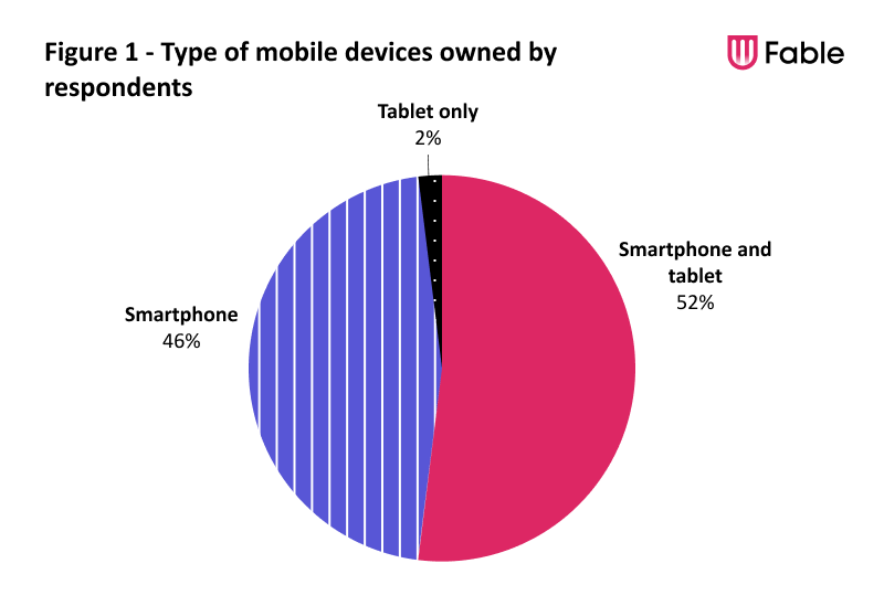
Just over half of the respondents (52%) own both a smartphone and a tablet. The remaining respondents are mostly smartphone owners (46%). A small percentage (2%) own just a tablet.
The majority of respondents buy a new smartphone every two to five years (68%) or only when their current smartphone breaks (23%)
With tablets, most folks buy a new one when it breaks (63%) or every two to five years to upgrade (32%)
Frequency of mobile use
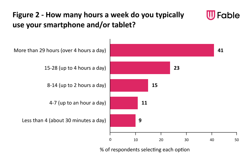
Fable community members use their mobile devices frequently. Many are on their mobile devices for more than 4 hours a day (41%)and another 23% spend about 2 to 4 hours per day on mobile devices.
About a quarter of respondents (26%) use a mobile device between 30 minutes and 2 hours per day. Only 9% of respondents use a mobile device for 30 minutes or less daily.
Top mobile tasks
What’s interesting is how multifunctional mobile devices are for people. Texting tops the list, followed by other modes of communication including emails and phone calls. Managing financials via banking apps and staying connected via social media are also popular.
Assistive technology users also seek entertainment options like music and podcasts, movies and videos, and games on their mobile devices.
Most common mobile accessibility barriers
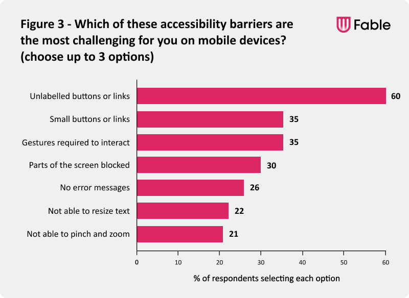
We asked assistive technology users to choose the three barriers that cause them the most challenges on mobile devices. The most frequently mentioned accessibility barriers involve buttons and links. The top responses were:
- Unlabelled buttons or links – 60%
- Small buttons or links – 35%
- Gestures required to interact – 35%
- Parts of the screen blocked – 30%
- No error messages – 26%
- Not able to resize text – 22%
- Not able to pinch and zoom – 21%
Unlabelled buttons or links
Unlabelled buttons and links top the list of challenges with 60% of respondents including it in their top three. Screen reader users are impacted more than other type of assistive technology users by unlabelled elements and 47% of the survey respondents are screen reader users.
Small buttons or links
Buttons and links that are too small to tap with a finger or require great precision to select are a challenge for anyone with mobility issues. Tiny buttons and links are also hard to read for anyone with low vision.
Gesture interactions
Gestures like swipe to delete, tap and drag, and anything more complex than a simple tap can cause problems for many users. Gestures can be difficult to discover and if you're not a power mobile user you may never figure them out.
Elements blocking parts of the screen
A chat button that is always hovering and may cover parts of the content. A sticky header or footer that takes up a big portion screen when the user zooms in or magnifies their device screen. These screen blockers can make it very difficult or impossible to view content for some users.
Missing error messages
Keeping a submit button inactive until a form is correctly filled out is often used instead of providing error messages. Sometimes a form does have error messages, but they are difficult to see based on the font colours, size and/or their location. Or perhaps the error messages aren't announced to screen reader users.
Resizing text and pinch and zoom
When an app doesn't respect the custom font sizing applied in the device's accessibility settings, people who need larger text must find alternative ways to read content like pinch and zoom gestures. However, some apps disable pinch and zoom as well. This feature is not just useful for enlarging text but is often used with images.
More mobile accessibility barriers identified include:
- Low contrast – If the contrast between text and background is low, it makes it harder for folks with visual impairments or sensitivity to bright lights. Customizing contrast settings can make content more legible for a broader range of users.
- No dark mode – For some users, black text on a white background can be painful to the eyes or trigger migraines.
- Fixed orientation – Not being able to rotate from portrait to landscape can impact people who have their device in a fixed position or people with low vision who use landscape mode to make text and images larger.
- Missing captions – Despite the fact we don’t specifically recruit people who are Deaf or hard of hearing for our community, no captions on videos was also cited. This could mean community members have more than one disability or some folks may prefer captions for reasons other than hearing loss.
Most common mobile accessibility barriers

We asked assistive technology users to choose the three barriers that cause them the most challenges on mobile devices. The most frequently mentioned accessibility barriers involve buttons and links. The top responses were:
- Unlabelled buttons or links – 60%
- Small buttons or links – 35%
- Gestures required to interact – 35%
- Parts of the screen blocked – 30%
- No error messages – 26%
- Not able to resize text – 22%
- Not able to pinch and zoom – 21%
Unlabelled buttons or links
Unlabelled buttons and links top the list of challenges with 60% of respondents including it in their top three. Screen reader users are impacted more than other type of assistive technology users by unlabelled elements and 47% of the survey respondents are screen reader users.
Small buttons or links
Buttons and links that are too small to tap with a finger or require great precision to select are a challenge for anyone with mobility issues. Tiny buttons and links are also hard to read for anyone with low vision.
Gesture interactions
Gestures like swipe to delete, tap and drag, and anything more complex than a simple tap can cause problems for many users. Gestures can be difficult to discover and if you're not a power mobile user you may never figure them out.
Elements blocking parts of the screen
A chat button that is always hovering and may cover parts of the content. A sticky header or footer that takes up a big portion screen when the user zooms in or magnifies their device screen. These screen blockers can make it very difficult or impossible to view content for some users.
Missing error messages
Keeping a submit button inactive until a form is correctly filled out is often used instead of providing error messages. Sometimes a form does have error messages, but they are difficult to see based on the font colours, size and/or their location. Or perhaps the error messages aren't announced to screen reader users.
Resizing text and pinch and zoom
When an app doesn't respect the custom font sizing applied in the device's accessibility settings, people who need larger text must find alternative ways to read content like pinch and zoom gestures. However, some apps disable pinch and zoom as well. This feature is not just useful for enlarging text but is often used with images.
More mobile accessibility barriers identified include:
- Low contrast – If the contrast between text and background is low, it makes it harder for folks with visual impairments or sensitivity to bright lights. Customizing contrast settings can make content more legible for a broader range of users.
- No dark mode – For some users, black text on a white background can be painful to the eyes or trigger migraines.
- Fixed orientation – Not being able to rotate from portrait to landscape can impact people who have their device in a fixed position or people with low vision who use landscape mode to make text and images larger.
- Missing captions – Despite the fact we don’t specifically recruit people who are Deaf or hard of hearing for our community, no captions on videos was also cited. This could mean community members have more than one disability or some folks may prefer captions for reasons other than hearing loss.
Accessibility heavily influences purchases
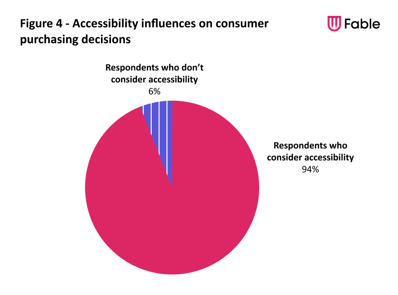
Similar to how assistive technology users evaluate apps for accessibility, it also has the same influence on which businesses they support. 94% of respondents factor the accessibility of apps and mobile sites into their decision around which businesses to support at least sometimes. Only 6% never do.
“I think that the iPhone is the ultimate in digital accessibility. Apple gave people with disabilities a device we could use with equality–I can’t count the ways it has improved my life. Apple proved that a mainstream device could truly be used by everyone who wanted to try. I’ve said it before–being able to use the iPhone, anyone’s iPhone! makes me feel like a real human being.” – Marcia Y., screen reader user
Conclusion
81% of respondents believe that accessibility barriers have a significant impact on their ability to enjoy their mobile devices.
Mobile accessibility is a critical aspect of the digital landscape, and the insights shared in this article highlight the importance of prioritizing it in design and development. Accessibility doesn't just benefit people with disabilities, but it also makes it easier for seniors and anyone with temporary limitations to access products and services on mobile devices.
Businesses that ensure that all users can benefit from mobile access can earn the respect and loyalty of this large customer segment. Additionally, they'll play a part in making the digital world a more inclusive and equitable place for everyone.
