Configurable dashboards
How it works
You now have access to a variety of widgets that allow you to customize your dashboard view.
The dashboard also introduces a global date filter. All reports can now be filtered by the same time frame, instead of having to update each individually.
Setup instructions
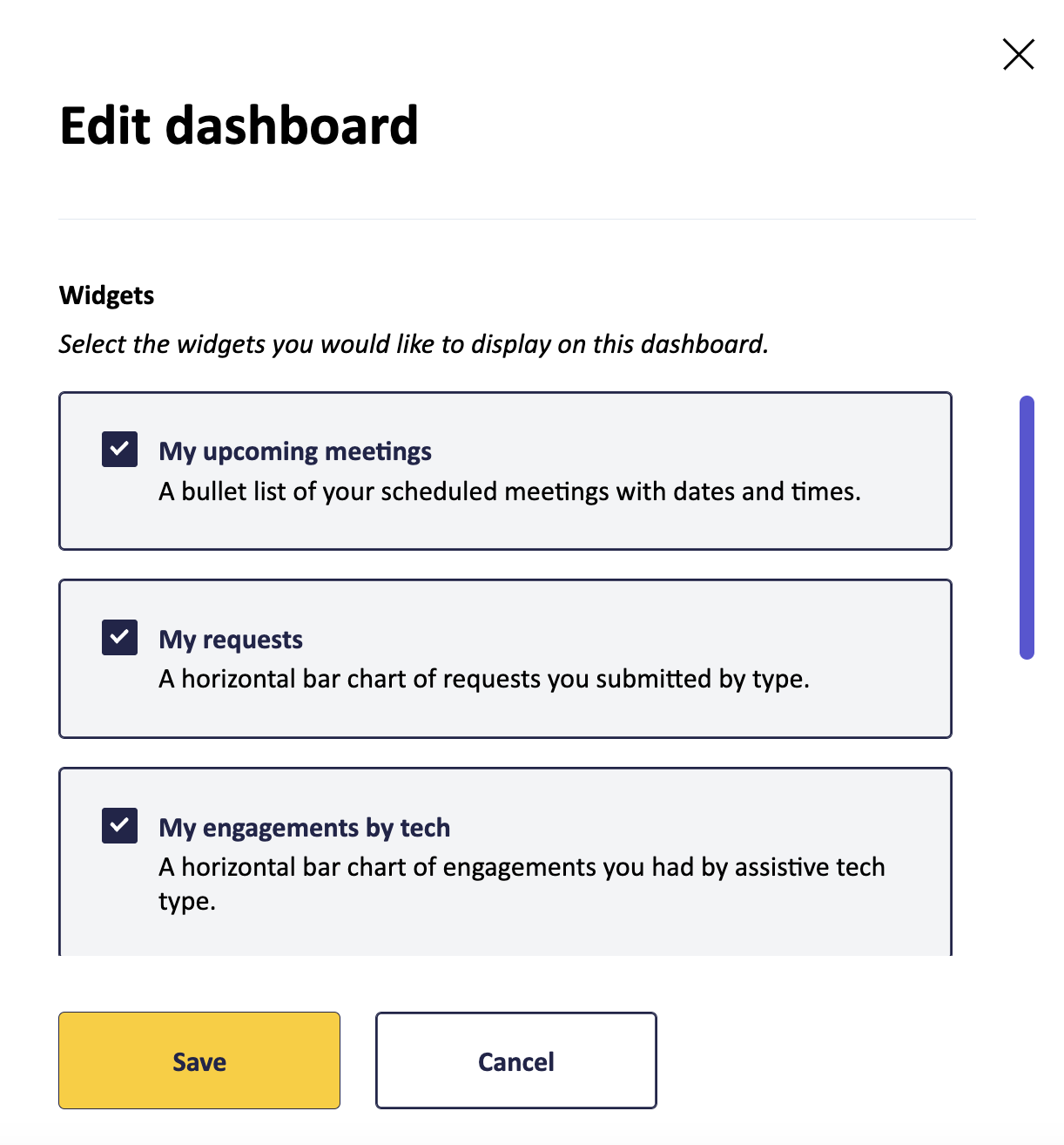
Select the “edit dashboard” button and choose the widgets you would like to display on your dashboard. Each widget includes a description to tell you what data it provides.

Available widgets
The tables below outline the widgets available based on your role.
My dashboard
| Widget Name | Description | Role |
|---|---|---|
| My upcoming meetings | A bullet list of your scheduled meetings with dates and times. | Users, Admins |
| Need help? | Ways to reach out to Fable for support. Cannot be hidden. | Observers, Users, Admins |
| My requests | A horizontal bar chart of requests you submitted by type. | Users, Admins |
| My engagements by tech | A horizontal bar chart of engagements you had by assistive tech type. | Users, Admins |
| Recent activity | Lists the recent activity completed by you and your team. | Observers, Users, Admins |
| *New results | A table of completed requests from your team within the last 30 days. | Observers, Users, Admins |
| *New clips | A table of clips created from your team within the last 30 days. | Observers, Users, Admins |
Company dashboard (Admins only)
| Widget Name | Description |
|---|---|
| Requests used | A horizontal bar chart of requests your team submitted by type. |
| Engagements by tech | A horizontal bar chart of engagements your team had by assistive tech type. |
| Export activity | Total exports completed by your team by type of export. |
| Recent activity | Lists the recent activity completed by you and your team. |
| *Requests used over time | Cumulative area chart of requests used by your team by type. |
| *Requests used each month | Stacked vertical bar chart of requests used by your team by type, compared month to month. |
| *Engagements by tech over time | Cumulative area chart of engagements your team had by assistive tech type. |
| *Engagements by tech each month | Stacked vertical bar chart of engagements your team had by assistive technology type, compared month to month. |
| *Average AUS score over time | Line chart of the average AUS score based on your requests. |
| *Task completion rate over time | Line chart of the task completion rate based on your Compatibility Tests. |
*New widgets available as part of this update
Troubleshooting and support
If you have any questions, please email us at support@makeitfable.com.
