Benchmarking accessibility using Fable Engage
When it comes to benchmarking and reporting on your accessibility progress, you have options! In this article, I’ll share several approaches you can take to benchmark your accessibility efforts using Fable Engage.

Kate Kalcevich, Head of Accessibility Innovation
Product accessibility is supported by the processes your team uses and the knowledge of your team members. If you don’t see product accessibility improving over time, evaluate your accessibility training, tools, and processes for gaps.
How accessibility benchmarking works
Benchmarking helps you evaluate product accessibility regularly in order to show progress. First, you’ll need to find out your baseline and then you can benchmark against that baseline over time. Your baseline is your digital product’s current accessibility.
Fable Engage provides two primary ways to measure accessibility through the experiences of assistive technology users:
- Accessible Usability Scale scores
- Task completion rates
When deciding which to use, think about the metrics that your organization currently tracks on a regular basis. Aligning your accessibility metrics to other business metrics will help you show impact in a way that you know leadership cares about.
Once you have your baseline captured, the cadence at which you run regular benchmarking requests will depend on your product development velocity. Benchmarking works best if you address the accessibility issues you find by making improvements. We suggest you fix at least 80% of the high severity issues before repeating benchmarking.
Benchmarking approaches
Measure usability with AUS
The Accessible Usability Scale (AUS) is a free tool to measure the usability of a digital product for assistive technology users. Inspired by the System Usability Scale (SUS), the Accessible Usability Scale consists of ten questions administered at the end of a user experience to generate a score.
Using Fable Engage, you can get an AUS score after a User Interview and from a Self-Guided Task. You can average a minimum of three user’s AUS scores for each task flow, but we recommend running a study with five to seven users of different types of assistive technologies to get a more robust score.
You can track the AUS score for all requests in a project using the project analytics feature in Fable Engage as shown below.

An Average AUS score over time report for requests in all projects is available to company managers on the company dashboard in Fable Engage:

If you’re using the System Usability Scale (SUS) as a metric already, you can evaluate it against your AUS scores to see how the experiences of assistive technology users compare with all product users.
Measure task completion with Compatibility Tests
Compatibility tests will give you the following quantitative data points:
- Completion rate (how many testers completed the task)
- Accessibility (how accessible did testers perceive the task to be)
- Recommendation (whether they would recommend the task to another user of their assistive technology)
- Ease of use (how easy/difficult the task was to complete)
- How many issues were identified
You can also review the tester feedback and assign a severity rating. I like to use the following approach to evaluate severity:
High: Issue blocks completion of a task
Medium: User can’t complete task as expected
(for example, it’s hard to do, takes a long time or requires a work around)
Low:
- User suggests a fix based on preference/ease of use
- User has to think about how to complete task
- User makes more than one attempt before succeeding
You can track the task completion score for all requests in a project using the project analytics feature in Fable Engage, as shown below.

A Task completion rate over time report for requests in all projects is available to company managers on the company dashboard in Fable Engage:

You can manually combine task completion rates for different products to compare accessibility progress across your organization:
")
Creating a benchmarking project
Here’s how you can create a Fable project specifically for benchmarking.
- Determine what product or task flow you want to benchmark. Benchmarking works best with a product that is actively being worked on and has accessibility improvements as part of that workflow. Create a new benchmarking project for that product.
- Determine what the most important tasks are within the product or choose a single task flow to benchmark. For example, here are some common key task flows:
- Create an account and log in
- Search
- Add to cart
- Checkout
- Contact support
- Decide which request types to use. Use Compatibility Tests for more quantitative data points and to get feedback from more users with fewer requests. Use User Interviews or Self-Guided Tasks to get AUS scores and more qualitative usability feedback.
- Decide how many requests to run for each key task flow. The more data points you collect, the more accurate your benchmarking will be. A comprehensive benchmarking project that presents a snapshot of your current level of accessibility could involve:
- Compatibility Tests to get completion rates for each key task.
- Five to seven User Interviews or Self-Guided Tasks to get an AUS score for each key task.
- Create requests for each task flow within the project. If using the example above, you’d create one Compatibility Test and five to seven User Interviews or Self-Guided Tasks for each key task flow.
- Once you’ve set up the project and all the requests within it, you can re-run the requests on a regular cadence using the recurring request feature. This works best if you make changes to the product based on findings before re-running benchmarking.
Example benchmarking approaches
Benchmarking usability for people with disabilities versus usability for all users
This approach complements a general usability metric such as SUS. Use User Interviews or Self-Guided Tasks to collect AUS scores to compare against the SUS scores.
This is a good approach for evaluating if you are truly being inclusive as an organization. If you have significantly worse usability for users of assistive technology compared to all users, that’s a sign that you need to make sure that accessibility is prioritized as part of user experience within your organization.
")
Benchmarking accessibility across devices
This approach uses Compatibility Tests. Identify which tasks you want to benchmark, run Compatibility Tests with both laptop / desktop users and mobile users. Compare the differences in accessibility, ease of use, and task completion across both device types.

This can help you identify if you have a significant difference in accessibility for different devices and can be compared to your site analytics for visitor devices. For example, if 80% of visitors to your website are using a mobile device and mobile testing shows poor accessibility, you’d want to prioritize improving the mobile experience over the laptop and desktop experience.
")
")
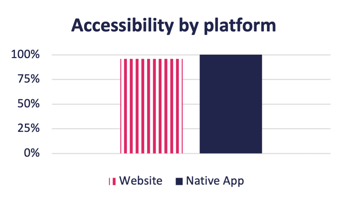
Benchmarking accessibility across platforms
To compare platform accessibility, identify which platforms you want to benchmark (for example, website, iOS app, Android app, blogs/social etc.) and choose tasks that are the same or very similar on each platform. For example, looking up contact information. Use the Compatibility Test request type for Laptop / Desktop, along with Mobile custom audiences for iOS and Android to segment your benchmarking.

This data can help you to prioritize which platform to tackle first. For example, if your website is fairly accessible, it might require minimal effort to just fix any issues. This approach prioritizes your internal resources. Conversely, if your iOS app is very inaccessible, you may want to start by tackling the biggest barriers there, because that will have the biggest benefit for your users.
Benchmarking assistive technology types
For the last approach you can use Compatibility Tests, User Interviews or Self-Guided Tasks. If you use Compatibility Tests, separate out the data for each tester and compare the screen readers (average the 3 users) against the alternative navigation (1 user) and magnification (1 user) scores. You can also create requests that consist of all one type of assistive technology. You can look at any data returned by the Compatibility Test – task completion, accessibility, ease of use, or recommendation.
This approach can be helpful in prioritizing accessibility fixes by assistive technology type. For example, you can fix key task flows for magnification users first, and then tackle all screen reader issues, and afterwards alternative navigation. That allows you to create a more accessible experience for one type of assistive technology, instead of tackling accessibility issues by priority, effort or another approach. At the end of the day, a partially accessible experience isn’t really an accessible experience at all.
")
Analyze your data
Compatibility Tests
The completion rate of a Compatibility Test can be a good indicator of severe accessibility barriers. Anything less than 100% of testers complete the task, it means there was a barrier that prevented them from completing the task and those barriers should be high priority to fix. You can easily find the blockers identified by reviewing the tester feedback on Fable Engage.
The number of issues identified is less important than the feedback you get from testers. You need to put the issues in context of severity (using the guidance I gave in Measure task completion with Compatibility Tests or your own rating system). A compatibility test with 5 issues that are all high severity is more concerning than one with 25 issues that are all low severity.
Recommendation can be a third metric that you use along with completion rate and number of high severity issues to help contextualize the data.
Accessible Usability Scale
For the AUS score, it’s critical to understand not just the score itself, but to have the notes from the researcher on what happened during the User Interview that caused a low or high score. For Self-Guided Tasks, you can take notes as you watch the video clip to determine the parts of the experience that were good and bad.
It’s the notes that will help you understand what needs to be fixed so that your next benchmarking exercise can lead to a higher score. This isn’t always the case because sometimes fixing one issue that was a major barrier, just means users will move further along in the task flow and discover other major barriers that they couldn’t previously identify. This is still good learning for the team. Using prototype reviews and inclusive design approaches can help avoid these major barriers in future product development and redesigns.
Project Analytics
You can also use the Project Analytics feature to visualize the data generated by your requests. For any projects where you have more than one request, when you open the Project Analytics tab you will get statistics that include:
- Average AUS score for all User Interviews and Self-Guided Tasks in the project (and how the results compare to your AUS target if you’ve set one).
- Average task flow completion for all Compatibility Tests in the project.
- Number and type of requests completed.
- Number of tester engagements by assistive tech type.

You can also create reports here that will give you charts with the following:
- Average task flow completion by assistive technology type
- Average issues logged per user by assistive technology type
- Average AUS score by assistive technology type
Comparison charts let you compare up to 10 requests within a project:
- AUS score comparison
- Task completion comparison
- Compatibility Test survey result comparison

These charts can give you a more high-level overview of a series of requests and help you to quickly identify areas that need to be improved.

About the author
Kate Kalcevich, Head of Services, Fable
Kate Kalcevich is Head of Services at Fable. Kalcevich is an experienced accessibility leader and disability advocate with an extensive career. She most recently led digital accessibility efforts at Canada Post. Previously, Kalcevich held a series of progressively senior roles in the Ontario public service, including in product, user experience, and design roles. In recent years, she has focused on change management to increase the accessibility capabilities of organizations.