Measure progress over time
This article will walk you through the new reports available on the company dashboard that help you measure progress over time.
Average AUS score over time
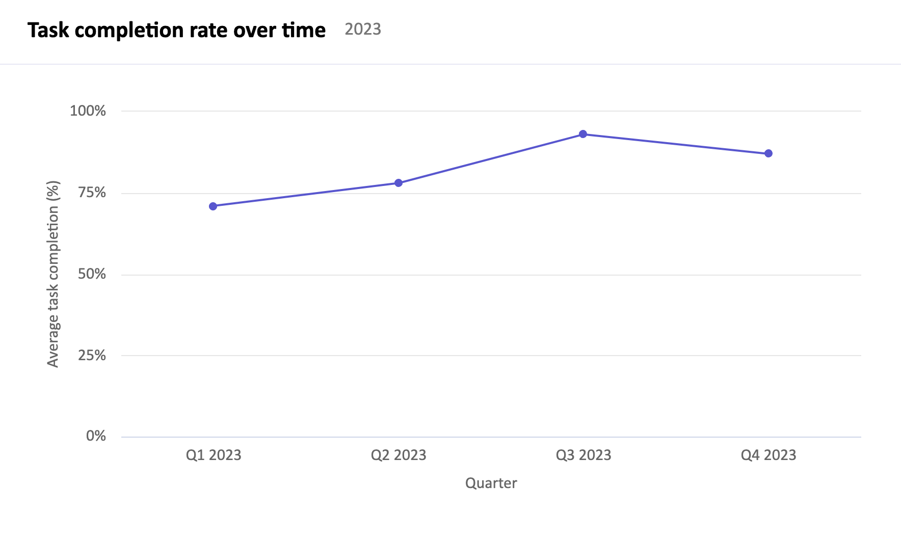
Task completion rate over time
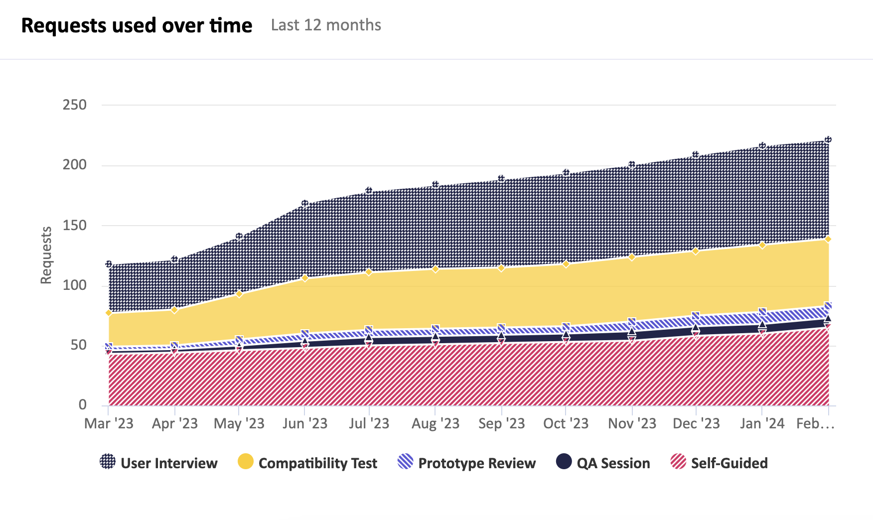
Request usage reports
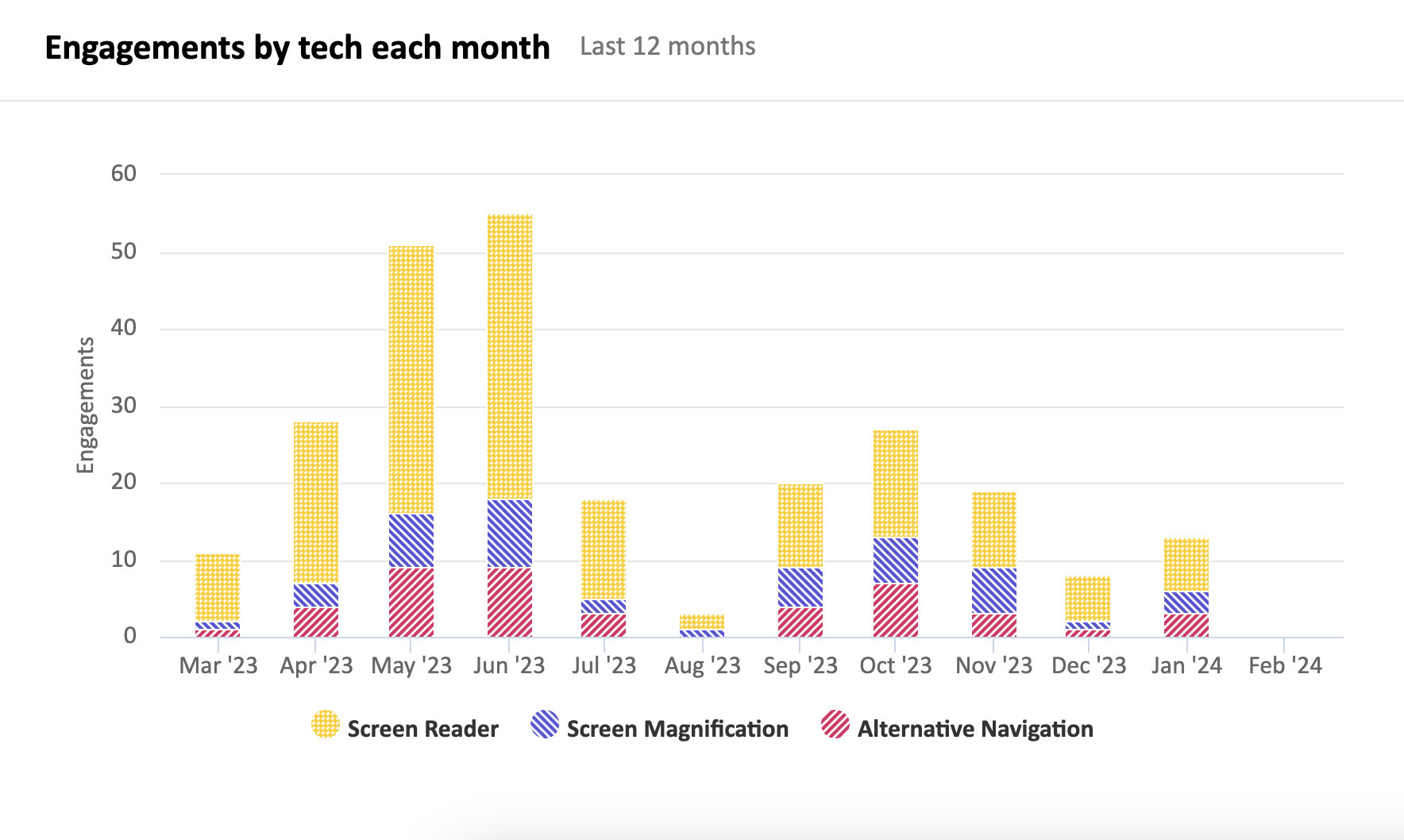
Engagement reports
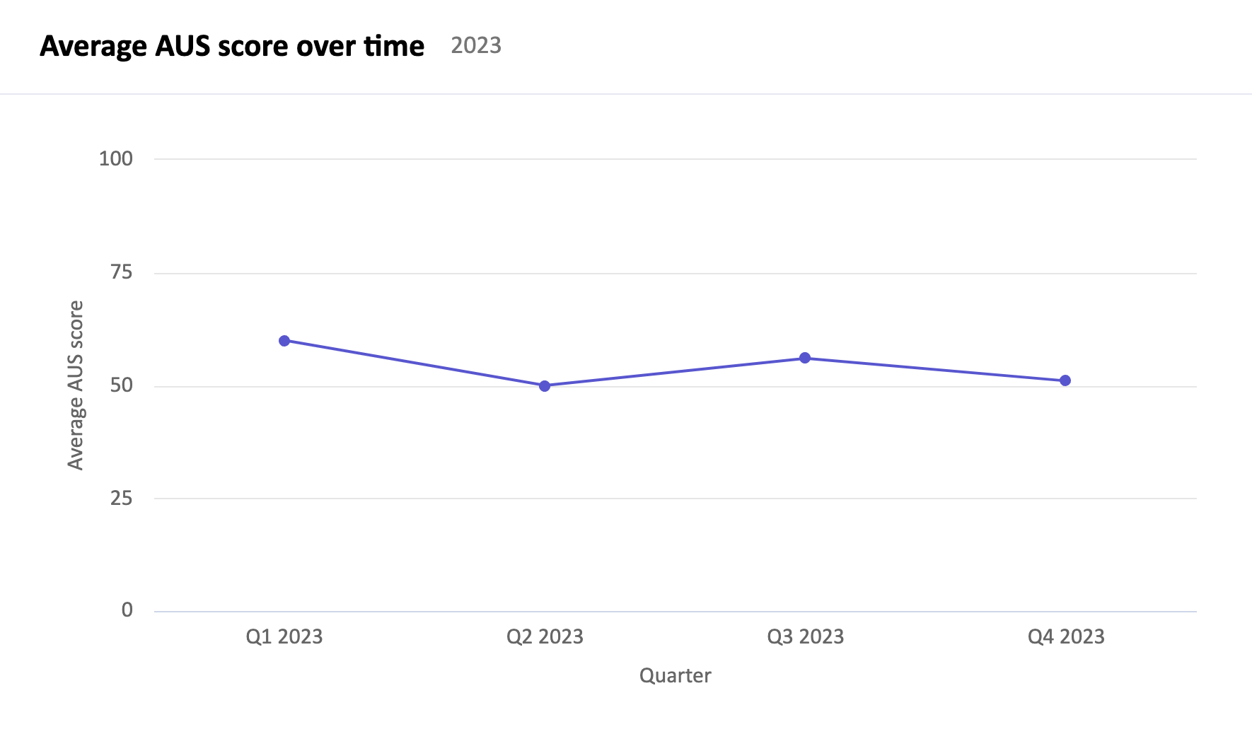
Average AUS score over time
Accessible Usability Scale (AUS) scores provide a measurement of usability, collected through User Interviews and Self-Guided Tasks. This report provides the quarterly average AUS score so you can see how your usability score trends over time.
Task completion rate over time
Task completion rates indicate if a task flow can be completed by people using different assistive technologies, collected through Compatibility Tests. This report provides the quarterly task completion rate so you can see how it trends over time.
Request usage reports
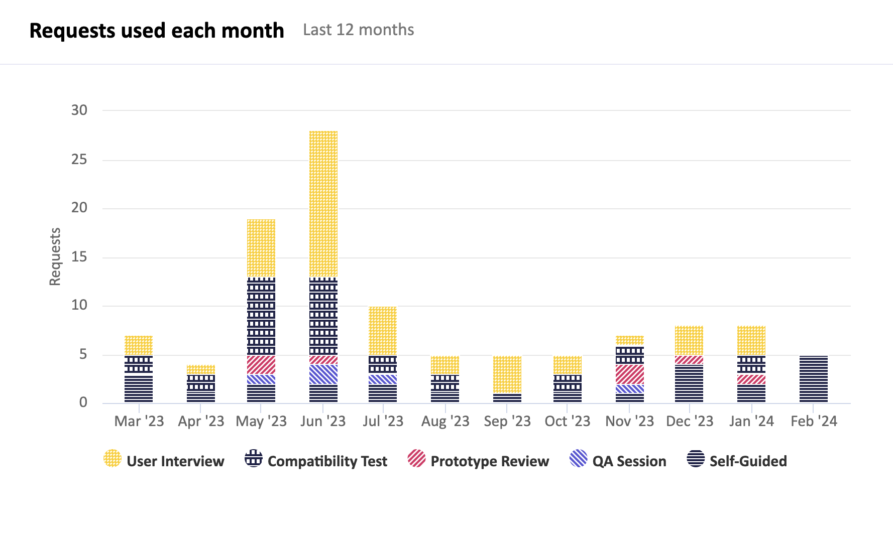
Fable has five different request types, each with their own distinct purpose. The “requests used over time” report provides the total cumulative usage of your requests, broken down by request type, so you can see your request distribution over time.
The “requests used each month” report provides a month to month comparison of requests used by type.
Engagement reports
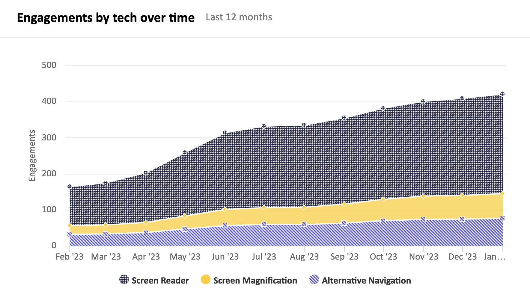
An engagement is an interaction with a member of our testing community. Meeting based requests count as one, whereas a Compatibility Test is with five testers and counts as five.
The “engagements by tech over time” report provides the total cumulative engagements, broken down by assistive technology type, so you can see which tech types you’re engaging with over time.
The “engagements by tech each month” report provides a month to month comparison of your engagements by assistive tech type.
