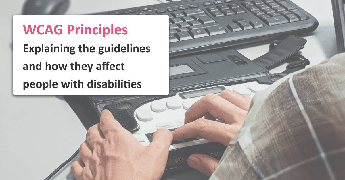

The real story on WCAG principles – from Sam, a screen reader user
Estimated reading time: 10 minutes
On this page
In this article, we explain the four core principles of accessibility. The core principles are part of the W3C’s Web Content Accessibility Guidelines (WCAG). They are:
- Perceivable: you should make sure everyone can enjoy your website, even if they can’t see or hear.
- Operable: everyone can use your website, even if they can’t use a keyboard or mouse.
- Understandable: everyone can understand your website, even if they have trouble with complicated language.
- Robust: everyone should be able to use your website, no matter what kind of computer or phone they use.
If you understand and follow these principles, you can make inclusive websites. There are limitations to these guidelines though, especially if you’re hyper focused on the success criteria. These guidelines were shaped by the experiences of assistive technology users, so don’t forget that user research and testing will also help you understand the accessibility of your product.
Introduction
If you’re new to your accessibility journey, the web content accessibility guidelines, commonly abbreviated as WCAG, can feel overwhelming. Packed with terms that are unfamiliar, including almost eighty success criteria, four principles, three levels of compliance, and pages of documentation, it’s sometimes a struggle to figure out how to begin! I’ll help you take a step back and figure out what it all means. By understanding four key principles, we can get a handle on what the WCAG are helping us accomplish, and why all those success criteria exist.
A better understanding of these guidelines will not only help you apply them to your website, but it will also help you come to an improved understanding of what accessibility means in practice. Once you’re comfortable with the four key WCAG principles, you’ll be able to prioritize and fix accessibility issues, and create websites that are more accessible, more inclusive, and easier to use for everyone.
As the Accessibility Evangelist at Fable, and a blind screen reader user, I’ll include examples of each principle from my years of lived experience, as well as the experience I’ve gained working with Fable’s diverse workforce of assistive technology users.
So, relax, get comfortable, and let’s dive into the four key principles of accessibility: perceivable, operable, understandable, and robust. By the way, to help you remember all four, they’ve been organized into the pneumonic “POUR”. Here we go!

Perceivable
If we want to make sure our content is accessible to as many people as possible, the first step is to make sure that everyone can perceive it. Based on who they are, what devices they’re using, or what environment they’re in, not everyone has access to all five senses. So, the first thing we should think about is: even without access to one or more senses, can someone still tell our content exists, and consume it?
Being perceivable is where some of the most discussed features of accessibility come in. First off, and most important to me personally, is alt text. I don’t have vision, and that means that I can’t see (or perceive) images. So, instead, authors should provide alternative text (usually abbreviated as “alt text”) for images. The alt text should communicate the same thing that the image tries to communicate, providing an alternative for those of us unable to see it. My screen reader can then read the alternative text to me, ensuring that I can access all your content. However, remember that it’s not only blind people who may be unable to see images. Some people on low-bandwidth connections choose to disable images entirely, and some devices don’t have the ability to display images at all.
Just as well known, and equally important, is the need for captions. Not everyone can hear; they could be deaf, they might not have working speakers, or they could be in a loud environment. Captions allow those without the ability to perceive audio, for whatever reason, to access your audio-based content along with everyone else.
While these are the two most well-known examples of how to make content perceivable, the principle expands far beyond them. Other things to consider include text size and colour contrast, ensuring controls (buttons, links, form fields, etc.) are correctly labeled, as well as the many other success criteria that WCAG includes under this principle.
Once you’ve made sure that everyone can perceive your content, no matter what senses they use, you’ve taken the first important step on the accessibility journey. It doesn’t do someone a lot of good if they know something exists on your website, but they’re unable to use it.
Operable
That leads us nicely into the second core accessibility principle. Now that everyone can perceive your content, can they operate your website? What if they don’t have a mouse? What if they can’t use a keyboard? What if they’re on a phone, and struggle with hand-eye coordination?
The WCAG has thought about all these questions and included success criteria to help you answer them. For screen reader users, it’s critical to ensure that everything can be operated by the keyboard. If a menu requires hovering with a mouse, or a button requires a click instead of pressing enter, I’m left completely unable to operate your website, even if I could access all the content.
When you correctly label controls on your website, not only are you helping screen reader users perceive them, you’re helping voice control users operate them. If a control has no label, users of voice control need to go through a complicated system of speaking on-screen coordinates, instead of just saying “click” and the name of the control.
Another occasionally overlooked set of guidelines involves timeouts. If you log someone out after five minutes, those who cannot type or read quickly may be unable to operate your website, because they are constantly logged out in the middle of a task.
Let’s assume that you’ve made everything on your website both perceivable and operable. Congratulations! You’re making great progress. The thing is, even if someone can see and use your website, it won’t help if they can’t understand it.
Understandable
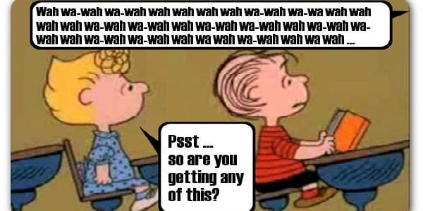
Have you ever visited a website in a language you don’t know? While you were there, you could probably see all the images and text, hear all the audio, and click the links and fill out the forms. Despite all that, you still had a hard time accessing whatever you were looking for on the site. Even if you used Google Translate, it might not have helped all that much.
Unfortunately, that could be the experience many people are having on your website, too. Maybe they speak English as a second language, or perhaps they have cognitive difficulties that make reading difficult. It could be that they’re just not an expert on the topic of your website, and the jargon is making it tricky for them to understand how to find what they need.
The WCAG includes success criteria about this too. Even if someone can perceive and operate your website, they still can’t access it in any meaningful way if they can’t understand it. These criteria involve things like consistent interfaces, clear iconography, and simple language. They’re also great examples of guidelines that will make your website better for everyone, not just users with disabilities. A website that’s easy to understand for a beginner will also be easier to understand for an expert.
So now you’ve got a website that is perceivable (everyone can access the content), operable (everyone can operate it), and understandable. Sure, it only works on Windows XP in Internet Explorer, and requires a specific screen resolution. But you’re done, right? Not quite!
Robustness
The last accessibility principle is robustness. Robustness means that no matter what device someone has, your website should be able to adapt itself to function on it. That way, no matter what device someone is using, your content will be accessible to them. Achieving robustness often means ensuring your website works on different screen sizes (from the largest monitors to the smallest Android phones), follows web standards to work with different browsers (from Firefox on Linux to Google Chrome on Windows 10), and will adapt gracefully to function on devices with low bandwidth or small processors.
Once again, this will help both people with disabilities, who may be using custom hardware or software that works best for them, as well as all your visitors who want to be able to use your website, no matter what device they have or what environment they’re in.

Conclusion
In this article, I’ve shared a brief, thousand-foot overview of the core principles of the WCAG guidelines from my perspective. Hopefully, this has helped you understand just what it means to be accessible, and why all those success criteria exist.
Once you’ve got a website that is perceivable, operable, understandable, and robust, you have a website that will be accessible, easy to use, and inclusive to everyone! Of course, that can be easier said than done. That’s why all of those WCAG success criteria exist. However, even they don’t cover everything, they’re just guidelines to help you out. Nevertheless, they are an important first step on your accessibility journey. May it be a long, exciting, and successful one!
When you’re thinking about how to improve your website’s accessibility, or how to design something that takes accessibility into account, take a minute to think about the “POUR” pneumonic. If you keep these basic principles at the forefront of your mind, you’ll find it much easier not only to think through WCAG compliance, but to build more accessible and more inclusive websites.
Do you have any questions or comments about this article? Reach out to us via LinkedIn or Twitter! If you’d like to learn more about Fable, and how we can help you test your products with real assistive technology users to make sure they’re perceivable, operable, understandable, and robust, book a call with us.


About the author
Sam Proulx, Community Lead, Fable
Samuel Proulx is the Community Lead at Fable. Sam has managed online communities in various spaces for 18 years; he brings this expertise to Fable, helping us build an inclusive team of people from all walks of life, which spans the entire country. Completely blind himself, he knows and values the importance of accessibility and diversity in all aspects of life. Sam is an expert in accessibility, accessibility testing, community management, Drupal, WordPress, and Ubuntu.