Building and testing an accessible video clipping component for people with disabilities
Reading time: estimated 7 minutes
On This Page
At Fable, we focus on product usability over accessibility compliance. After all, technical accessibility isn't a guarantee that your product is usable by people with disabilities. In this post, we'll talk about how we built and tested an accessible video clipping feature. We'll also touch on our plans to iterate on it in the future, with a focus on making the experience easier for all users.
Introduction
After a video session with Fable, like a User Interview, you can view the recording on the platform. This means you can focus your attention on the session while it’s happening, then review and take notes after. We recently upgraded our video player with brand new features to make it easy to share key moments. These features include video clipping and an interactive UI for viewing transcripts.

Establishing a baseline
Before starting development, we reviewed similar experiences from products that we've used before. We looked at Loom's video clipping UI and similar Video.js plugins for annotation. This gave us the framework for how to build video clipping into our video player. For conventions around working with timelines and by recommendation from Samuel Proulx, our Accessibility Evangelist and a blind screen reader user, we referenced common audio editing software. From here, we noted the use of custom keyboard shortcuts for important functionality.
We also took some cues from WCAG (Web Content Accessibility Guidelines). Specifically, Success Criterion 2.4.5: Multiple Ways. For our case, we knew it would be important to have multiple ways to set the start and end points of a video clip. Though 2.4.5 doesn't apply in this context, it does provide good insight into why it's helpful to give users options.
The intent of this Success Criterion is to make it possible for users to locate content in a manner that best meets their needs. Users may find one technique easier or more comprehensible to use than another.
– From Web Content Accessibility Guidelines, Section Criterion 2.4.5: Multiple Ways
Now, our 3 biggest development considerations were:
- Managing keyboard focus between video player features and video clipping features
- Implementing drag and drop functionality on the video timeline
- Adding custom keyboard shortcuts
Testing Plan
Here at Fable, we work in 2-week sprints and often take an MVP approach to planning features. For major features like this one, we release to employees first so that we can gather feedback. For our MVP, we ensured that all users could create a video clip end-to-end in at least one way. From there, we would do usability testing with Fable's community of accessibility testers.
Our user testing plan started with Compatibility Tests with mixed assistive technology users:
- 3 screen readers
- 1 alternative navigation
- 1 screen magnification
These tests would help verify that core functionality is working as expected across devices. They may also hint at assistive technologies to follow up on with User Interviews.
Our Compatibility Test results showed the on-screen keyboard experience as the most challenging. To dig deeper, we planned a User Interview with another alternative navigation user. This time, we spoke with a user of Dragon NaturallySpeaking. We wanted to see if the experience was like the on-screen keyboard experience and observe problem areas in real time.
In the future, once we action the feedback from our first round of testing, we can run follow up Compatibility Tests. This will help us to track accessibility over time. And of course, User Interviews with more types of assistive technology will help to enhance the overall user experience.
Creating a clip and managing focus
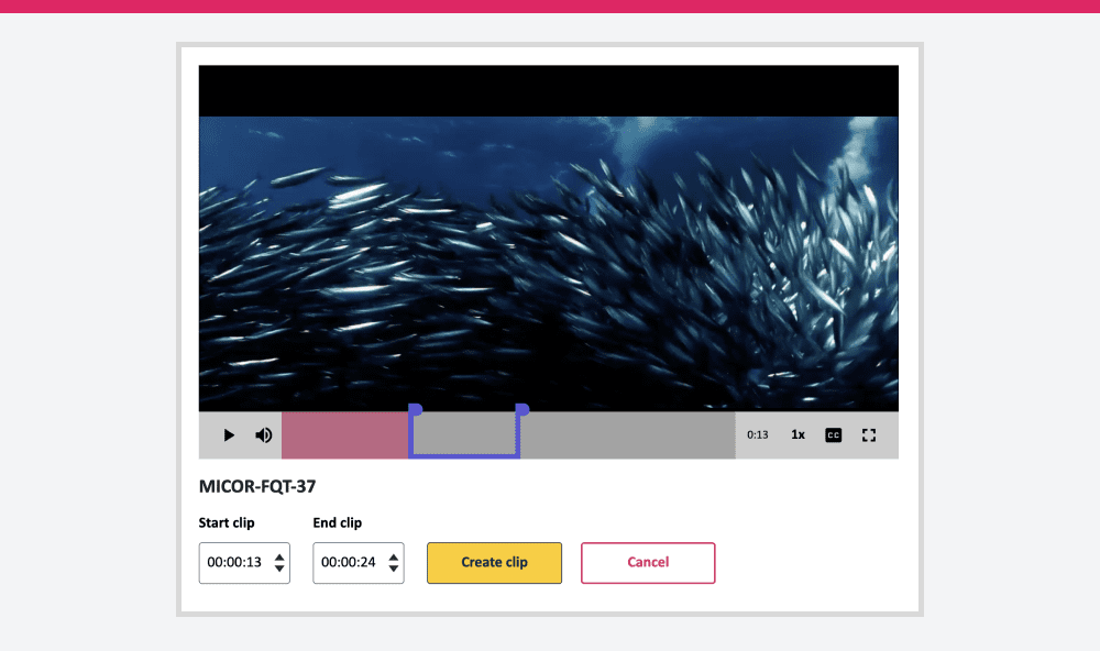
Our video clipping functionality has 2 main UI states: playing and editing. Once a user interacts with the “Create clip” button, a visible clip range displays on the timeline and new actions are available below the player. To make sure users can seamlessly start interacting with these new actions, keyboard focus is automatically set to the container of the action buttons using JavaScript.

For screen magnification users, our “Create clip” button ended up being difficult to find. This is because it’s placed on the right side of the video player instead of the left. Users are more likely to scan down a page first, instead of left to right and then down. Because of this, important actions or content should always be placed on the left.
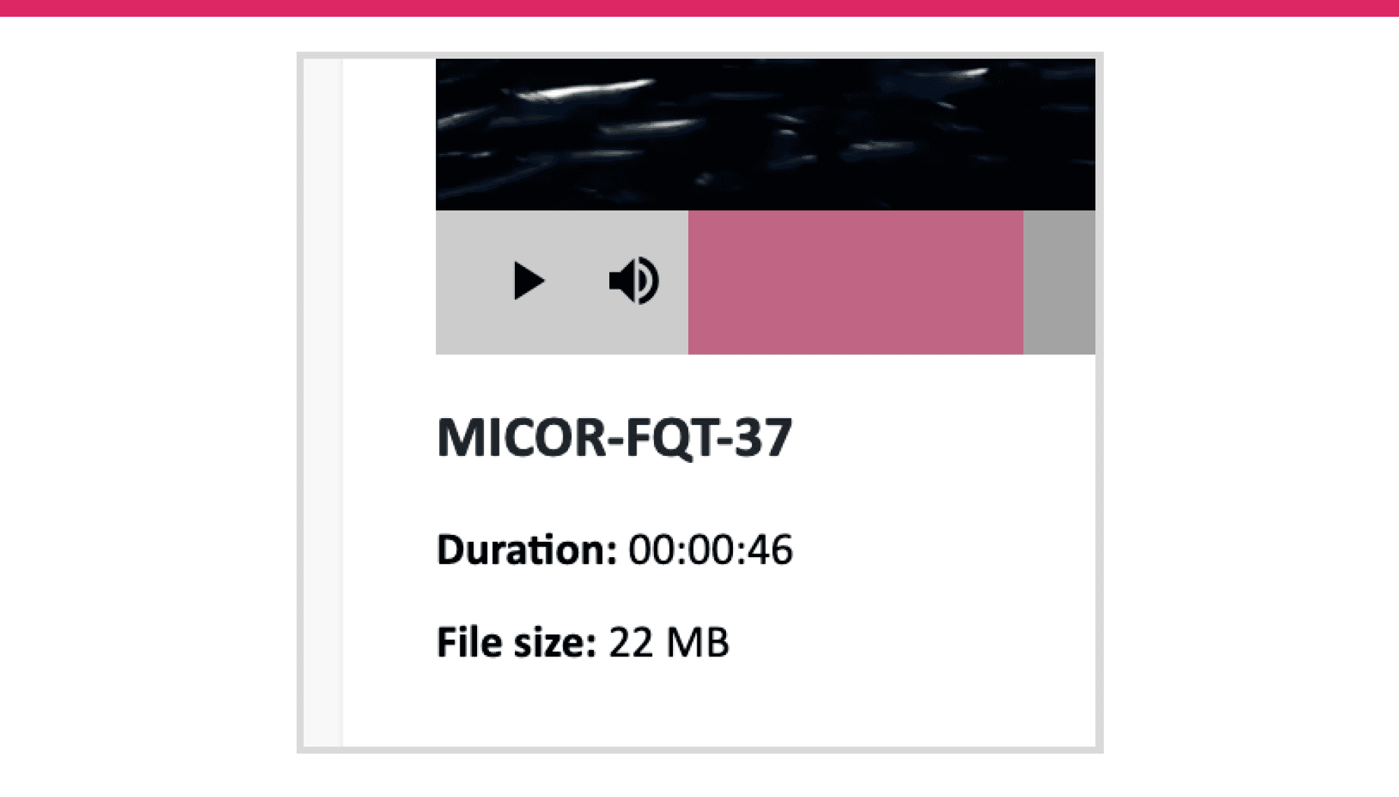
Below the video player is a table containing all videos and clips associated with a request. Selecting a video from this table updates the video player and moves the focus to the play button. Usually, setting the focus to an element on a different part of a page will automatically scroll the page to show that element in view. If you have a sticky navigation, it’s important to consider how it might cover important content when this happens.
After selecting a video to play, our Dragon NaturallySpeaking user had to manually scroll the page up to see the full player again. To avoid this, we can add some buffer space any time we set focus somewhere further on a page.
Selecting a clip range
When it came time to start building our clipping feature, we took a progressive approach to setting the start and end points. First, we started with setting a single point with a keyboard shortcut. From there, we allowed for refinement with textboxes, and then added drag-and-drop for more precise control while reviewing a video frame-by-frame.
Custom keyboard shortcuts
Custom keyboard shortcuts are a great way to add convenience to common tasks for power users. However, it’s important to ensure they don’t interfere with a user’s assistive technology. To help with this, WCAG provides three options as part of Success Criterion 2.1.4 Character Key Shortcuts:
- Users must be able to turn the shortcut off
- Users must be able to remap the shortcut, or
- The shortcut only applies while the component is in focus
For our purposes, it made sense to only apply the shortcuts while the video player was in focus. We used “s” and “e” to set the start and end points, respectively. But for release we didn’t document this feature, and as a result no one used them in our testing.
We also got feedback from screen reader users suggesting even more keyboard shortcuts, like for toggling the “Create clip” mode. In the future, we can provide visible instructions on the shortcuts available. This way all users can create clips more easily.
ARIA and text inputs

The start and end point text boxes are multi-purpose. First, they're the most universally accessible way to set and edit a point. But they're also the place where we display the timestamps of your points. Because of this, we wanted to make sure the time information is formatted in a useful way.
Video.js gives us timing data in seconds but we're used to seeing this information as a timestamp. To account for this, we convert those seconds into "hh:mm:ss" in the text boxes. We also added the ability to increase or decrease the current timestamp in a text box using the arrow keys.
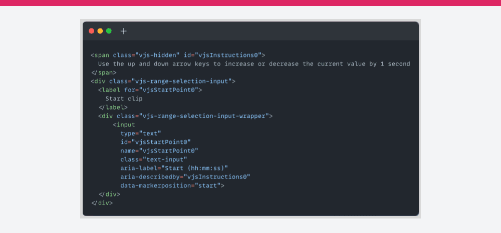
To make these extra details available to screen reader users in a convenient way, we used ARIA. ARIA (Accessible Rich Internet Applications) is a set of HTML attributes that define ways to provide functionality to assistive technologies.

In the code sample above, the format information “hh:mm:ss” is included in the aria-label attribute. This effectively overwrites the <label> for assistive technologies. We also used aria-describedby to include supplementary info about how to use the arrow keys. Now, when a screen reader user tabs to these text inputs, they’ll get this helpful information upfront.
Drag-and-drop timeline markers
Finally, our drag-and-drop functionality is a visual representation of the selected clip range. While dragging a start or end point along the timeline, users can see each frame update in real-time. For our MVP, we only made the handles operable by mouse. In the future, we can look to ARIA patterns like the multi-thumb slider for how to make this accessible to more users.
“All functionality that uses a dragging movement for operation can be achieved by a single pointer without dragging, unless dragging is essential.”
– From Web Content Accessibility Guidelines, Section Criterion 2.5.7 Dragging Movements (AA)
WCAG 2.2 includes new requirements around making it easier for users to operate functionality with different inputs. This update directly references drag-and-drop in 2.5.7 Dragging. Since we've already built text boxes that allow users to enter and edit a clip range, we satisfy this criterion.
Beyond selecting a clip range, some users had trouble working with our video timeline. Since the timeline hides when idle, our alternative navigation users didn't trust that they could use it consistently. This meant our Dragon NaturallySpeaking user initially avoided the timeline altogether. By disabling default functionality on the timeline, like not allowing scrubbing outside of the selected clip range while editing a clip, we also made it harder to see where a user was in the video. Usually, hovering over the timeline with a mouse shows a tooltip with the current time.
In the future, disabling the auto-hide feature of the timeline (at least while creating a clip), will help users who aren't using a mouse. We can also add tooltips back to the timeline for the current play time or the current time of the start and end point. This will help users with smaller screens, where scrolling to the text boxes below might be inconvenient.
Positive feedback
“Before accepting the request I balked at first because of the subject of editing a video. But after reading more I realized that this is something that I do with audio all the time and accepted the request. It was a lot simpler than I expected and I even downloaded a copy of the MP4.” – Screen reader tester on NVDA
“Generally, when I do any sort of video editing […] I’m not really using my Dragon because it’s usually a more cumbersome process, and in a lot of situations there wouldn’t be certain things I could do with Dragon. But in this case, there wasn’t anything I wasn’t able to do all with my voice.” – Alternative navigation tester on Dragon NaturallySpeaking
Thanks to some thoughtful planning before development, the results of our user testing were positive overall. We received encouraging comments from testers who didn't expect to be able to complete the task based on their previous experiences on the web. Our Dragon NaturallySpeaking tester applauded that they were able to do everything they wanted to with their voice.

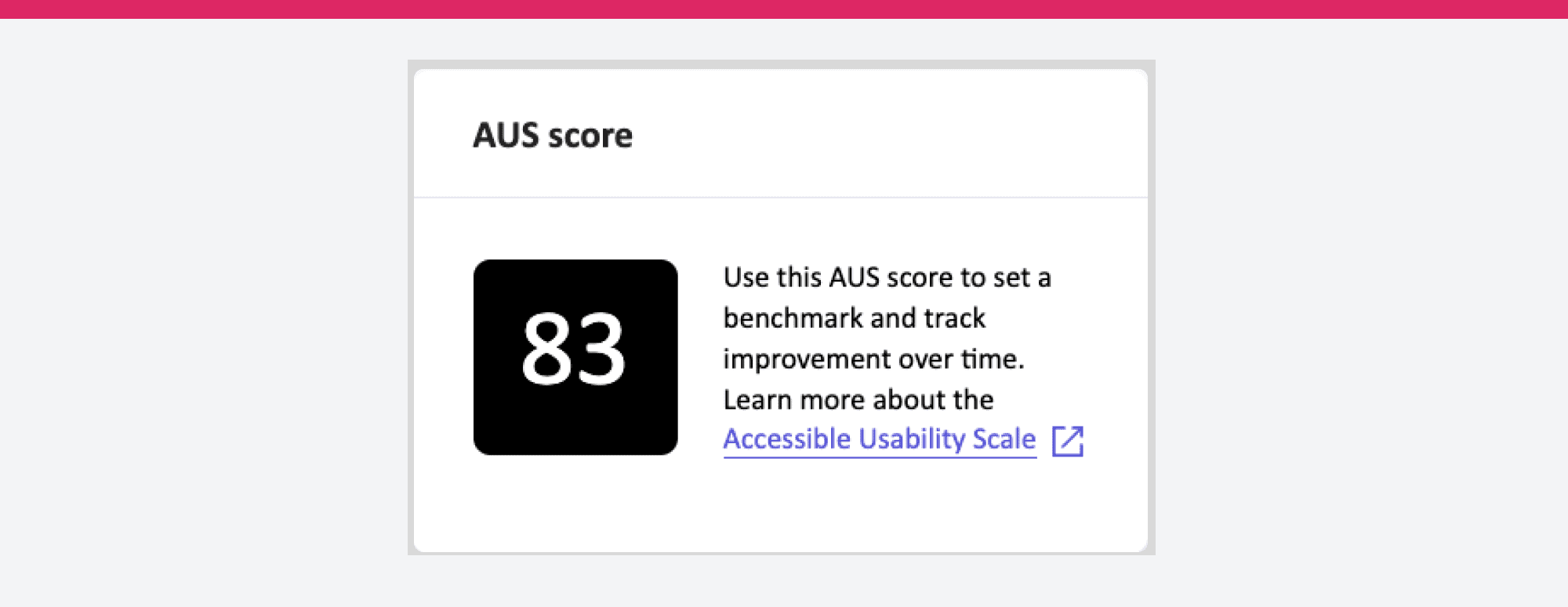
We received an AUS (Accessible Usability Scale) score of 83, which is a great starting point and allows us room for improvement. All our testers were able to complete the tasks in our Compatibility Tests, and our 3 screen reader testers found the experience very easy to use.
Looking forward
As an MVP, our video clipping feature has been a success. Users can easily create, edit, view, and share key moments in their Fable user interviews. Thanks to the feedback from Fable's community of accessibility testers, we have some quick wins and some ideas to take back to the drawing board, such as moving important buttons around to make them easier to find and rethinking how we interact with the video timeline.
All in all, making video features accessible can seem daunting at first. Hopefully, this insight into our process can inspire more teams to think inclusively, and realize that by doing so, they will improve usability for everyone.
